Polliflora
2022
Design & Visual Identity
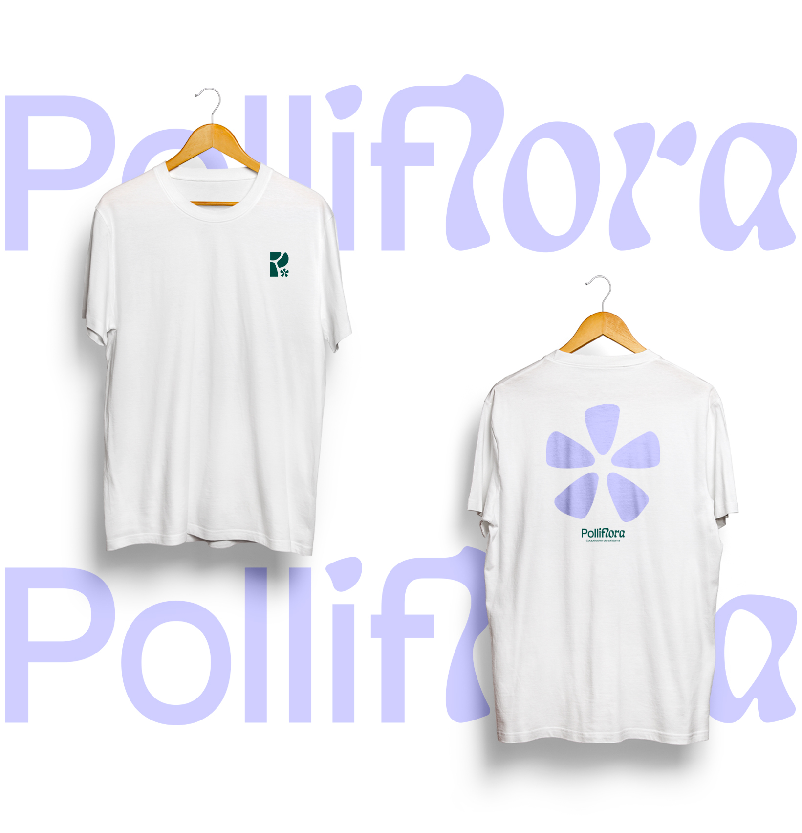
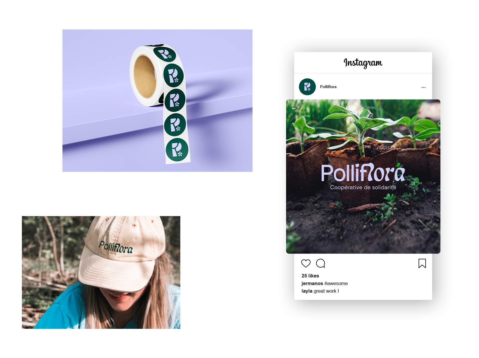
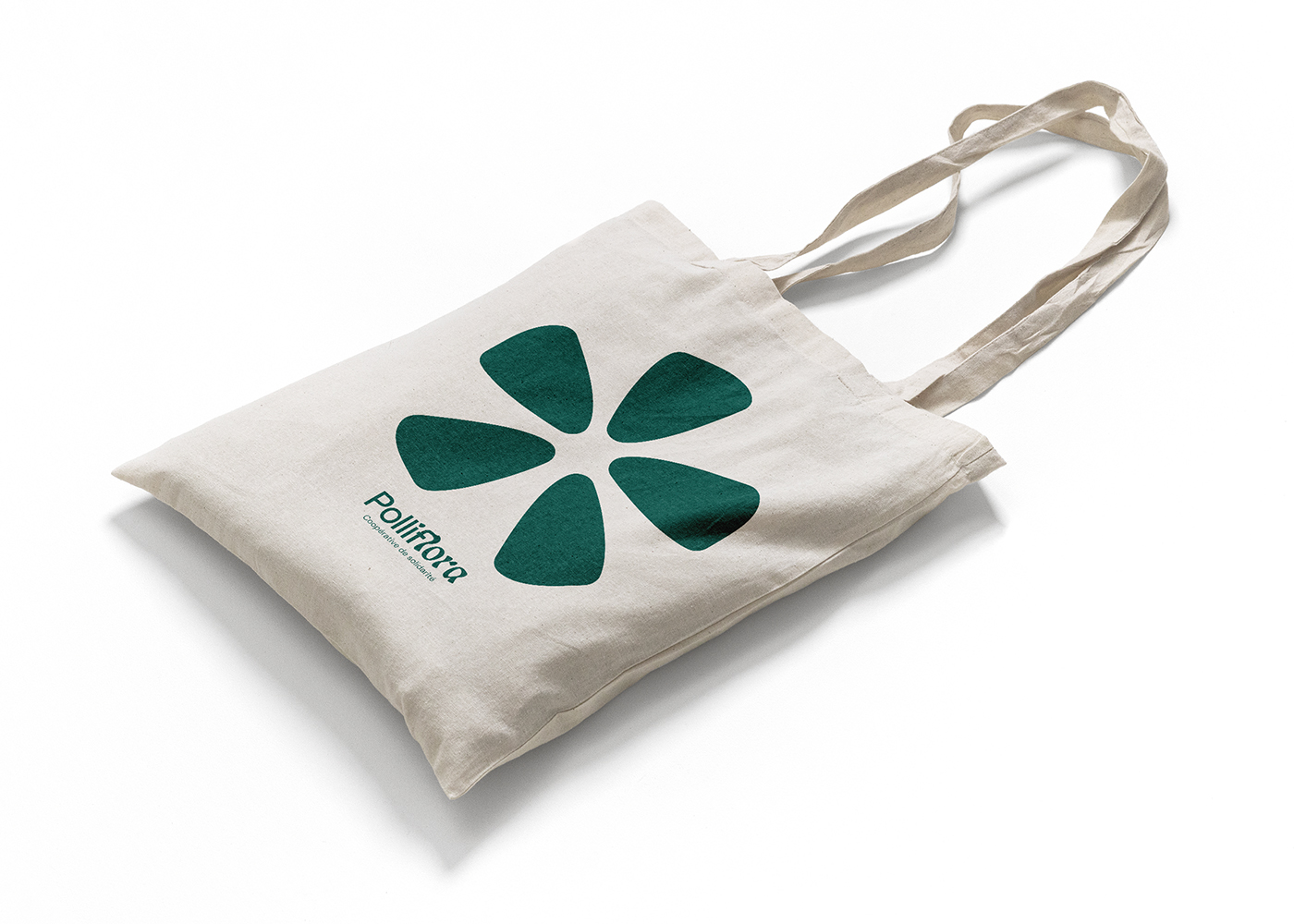
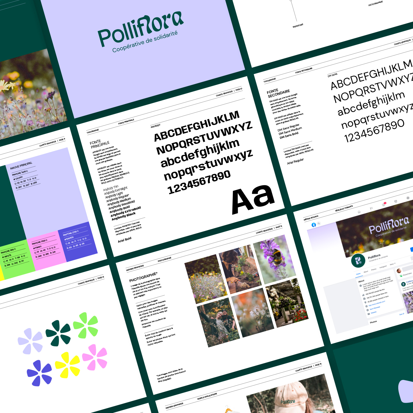
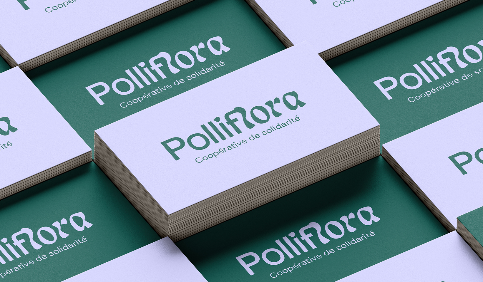
Polliflora
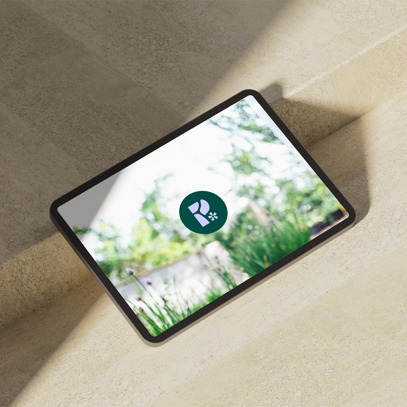
Born in 2011 from a citizen’s initiative, Polliflora, formerly Miel Montréal, is a solidarity cooperative whose mission focuses on three main areas: education on the importance of pollinators, the creation of habitats favorable to biodiversity, and the promotion of responsible beekeeping practices in urban areas.
Project
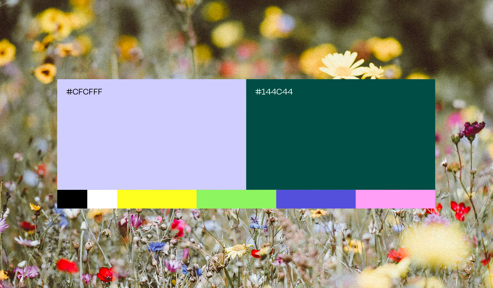
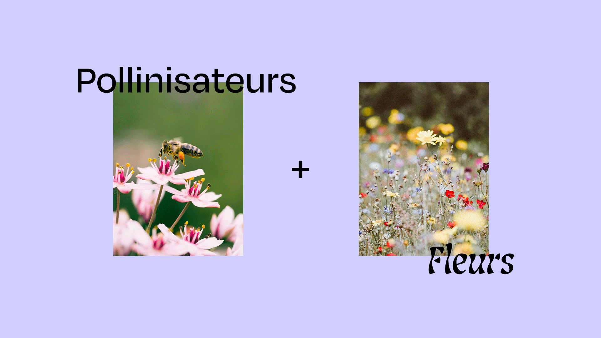
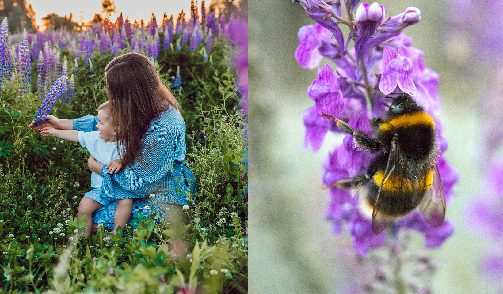
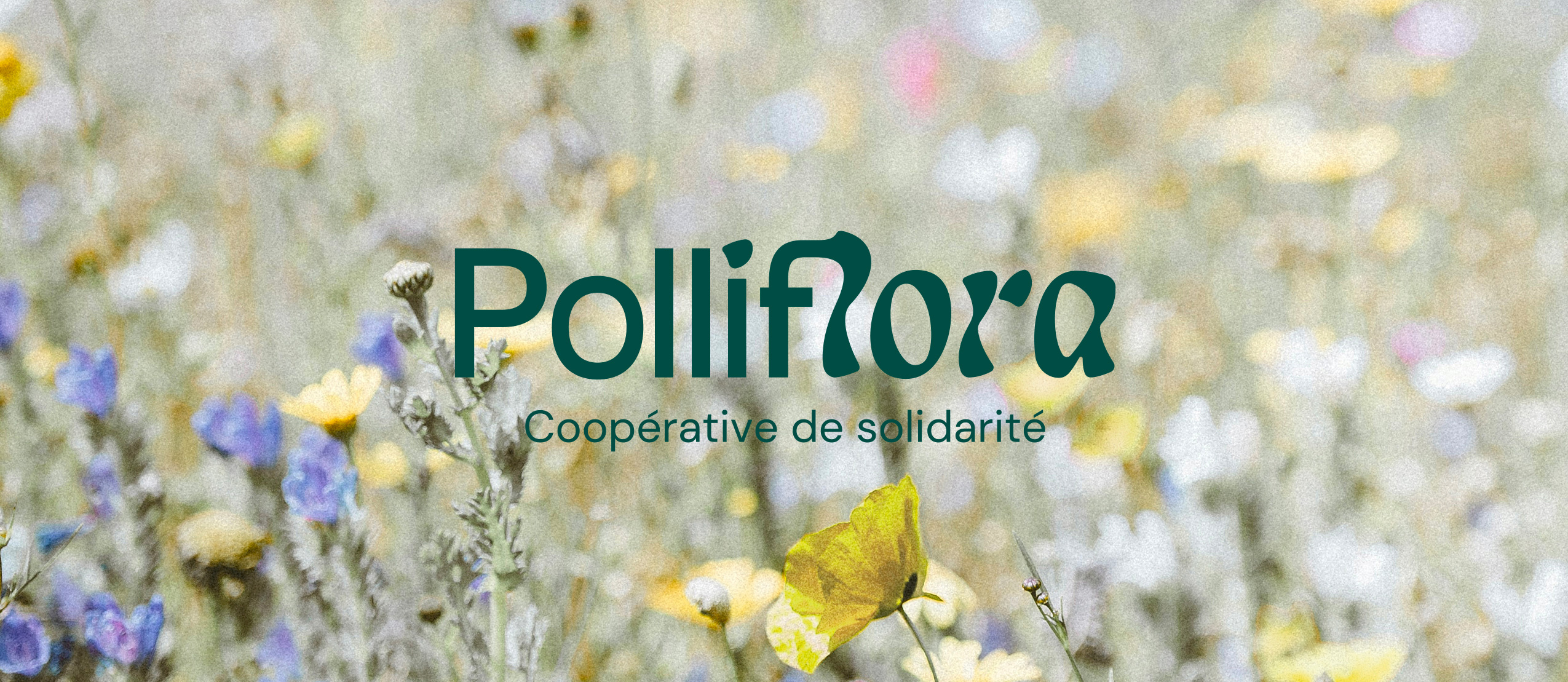
With the launch of a new greening service, Miel Montréal wanted to review its brand image and rethink its name to be more in line with this reality. Polliflora was born, a combination of “polli” for “pollinators” and “flora” for “flowers”. This was all it took to give our designer the ingredients needed to create a vibrant visual identity that unites these two parts. Brilliantly highlighted with a color palette drawn from the flowers present in the different greening projects of the cooperative, the result is obviously devoid of orange and red, colors that are not visible to pollinators.
Molotov loves bees! Responsible beekeeping respectful of the environment, yes please! It is therefore with great pleasure that we joined the Polliflora team for this mission that was able to buzz in us!